Beyond the Unemployment Rate
Published 17 June 2022
By Dr Peter J Phillips, Associate Professor (Finance & Banking) University of Southern Queensland


One of the handful of statistics that is always quoted as evidence of the economy going good or bad is the unemployment rate. But there is a deeper story to employment and unemployment, and it’s important to look beneath the surface. Fortunately, data is available at everyone’s fingertips. You just need to know where to find it and what to look for. And you must know how the terms are defined.
In Australia, the Australian Bureau of Statistics (ABS) presents a bunch of relevant information all in one place. The charts below were produced using data that can be downloaded to Excel from the ABS website.
The first piece of the puzzle is the unemployment rate itself. The unemployment rate is the percentage of people who are in the labour force who are unemployed. If you have a labour force of 100 people and 10 of them are unemployed, your unemployment rate is 10%. Leaving everything else aside, it would be a good sign if these 10 people could get jobs and a bad sign if they were joined by 10 more people who were out of work. Historically, the Australian unemployment rate looks like this:
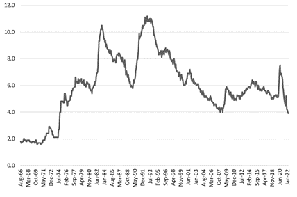
The key words in the definition of the unemployment rate are “in the labour force”. In our example, the labour force is 100 people and 10 of them are unemployed for an unemployment rate of 10%. But what if there are 10 more people who have, so to speak, given up looking for work and dropped out of the labour force? Really, there are 20 people from 110 that cannot find work, not 10 from 100. If so, the unemployment rate gives us a rosier picture and makes things seem better than they really are.
To get a clearer idea about the true situation, we must combine the unemployment rate statistic with some other statistics. The most important of these is the participation rate. This gives us some idea about how much of the working age and capable population (called the “in-scope” population) our labour force number (100 in our example) encompasses. The Australian Bureau of Statistics’ Labour Force Framework handily presents all the formulas. If the labour force is denoted by L and the “in-scope” population is denoted by P, then the participation rate is the ratio of L to P. And the unemployment rate, denoted by U, is the ratio of U to L.
In our example, there are 110 people in our in-scope population and the labour force is 100. Then the participation rate is 100/110 or 91%. Of those 100 people who are participating, 10 are unemployed for an unemployment rate of 10%. You cannot read the unemployment rate in isolation and, at the very least, you must know what the participation rate is to get a reasonably clear picture of what is happening with the labour market. So, what does Australia’s participation rate look like? It looks like this:
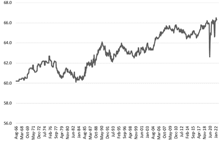
As we can see, labour force participation in Australia has been steady for a long time. And, if we put it together with the unemployment rate statistics you can see, for instance, how bad the early 1990s recession was. Not only did the unemployment rate spike, but the participation rate fell quite steeply. In 2022, with the unemployment rate at low levels we can likewise pair it with participation to assure ourselves that, for now, the low unemployment rate is not simply a reflection of discouraged workers having left the labour market.
If we examine the United States data, we find a somewhat different story. In May 2022, the unemployment rate in the United States according to the Bureau of Labour Statistics was just 3.6%. That’s about 6 million unemployed persons. The labour force participation rate seems to be okay. It’s 62.3% according to the same report, which is not that much different to Australia’s labour force participation rate. The problem is, in America the labour force participation rate has been falling for decades. From around 67% at the turn of century. The current rate of 62.3% is on par with the rate recorded in the early 1970s before a big increase through the late 1970s and 1980s, a levelling off until 2000, and then a steady decline. Viewed from this angle, 3.6% unemployment is good but not as good as it would have been in, say, 1988 when labour force participation was much higher.
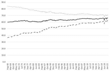
Like everything, there are stories within stories within stories. Who is leaving (entering) the workforce? Are older people discouraged (encouraged) or younger people or both? Men or women or both? In Australia, one of the most interesting underlying stories that can be found in the labour force participation rate is the gradual exit of men and the gradual entry of women. Here, the middle solid line is the overall labour force participation rate in Australia. The line above it (dotted), is the male labour force participation rate. The line below it (dashed), is the female labour force participation rate. These are the types of stories you can find beneath the statistics that are reported either breathlessly or mundanely on the daily news.
Discussion Question
Apart from the unemployment rate and the other statistics discussed above, what else would you need to know to construct a complete picture of the health of the labour market?
Further Reading
The unemployment rate is one of the macro indicators that investors consider when weighing up whether to invest in stocks and bonds. This is discussed in Chapter 7 of the text.
Read other posts
Algorithms in Finance? That's Nothing New
The Algorithm that finds the ‘Best’ Portfolio
Why you should study Finance and Economics in the 21st Century
From Chicago to New York: Futures Trading and Microwave Popcorn
Basketball, Fund Managers, and the Hot Hand
The French Connection in Finance Theory
The Road to Cryptocurrency, Instalment # 1
The Road to Cryptocurrency Instalment #2
The Road to Cryptocurrency Instalment #3
The Road to Cryptocurrency Instalment #4
The Road to Cryptocurrency Instalment #5
The Road to Cryptocurrency Instalment #6
The Road to Cryptocurrency Instalment #7
Imagination and the Future of Cryptocurrency
Bigger Than FinTech: The Less Obvious Innovation Transforming Finance
NFTs: A Brave New World for Artists?
Sometimes, Inflatoin is the Only Way Out